Save, share, collaborate, and communicate in the cloud.
ABOUT
MY ROLE
V A P O R T R A I L is a new cloud storage system that offers users the ability to network and collaborate with their data!
Now users can keep their data organized around the types of relationships they have with other users.
I designed this UX/UI for BLOC, working with Figma, Invision, Adobe Suite, Google Forms, Sketch, and InVision into successful conceptualize, research, prototype, and, finally, deliver a product the client was ecstatic about.
CLIENT CRITERIA
The design process started as soon as I received a client brief involving these key product features:
- saving content you find on the web (links, images, videos, etc.)
- creating content (notes, documents, maybe spreadsheets?)
- uploading files (videos, images, PDFs, etc.) from a computer or mobile device
- sharing a single item with someone else (and vice-versa)
- sharing a folder or group of items with someone else (and vice-versa)
- connecting with other users for real-time collaboration in notes or documents
-organizing that content using things like categories, tags, groups, and/or folders
PROBLEM
It’s important to note that the client was well aware that they were entering a crowded marketplace. Despite this, they wanted a cloud storage service. Even before I was able to conduct market research, a few problems stuck out to me that this product would need to solve.
CLIENT’S PROBLEM
- design a cloud storage product outlining all the requested functionality as well as being unique
DESIGN PROBLEMS
- crowded cloud storage marketplace
- provide users with a balance of common features
- provide users with the ability to network inside the product/service
- duplicating competitors
SOLUTION
First and foremost, deliver a cloud storage service. From there implement an additional feature entailing the client’s desired network effect.
RESEARCH
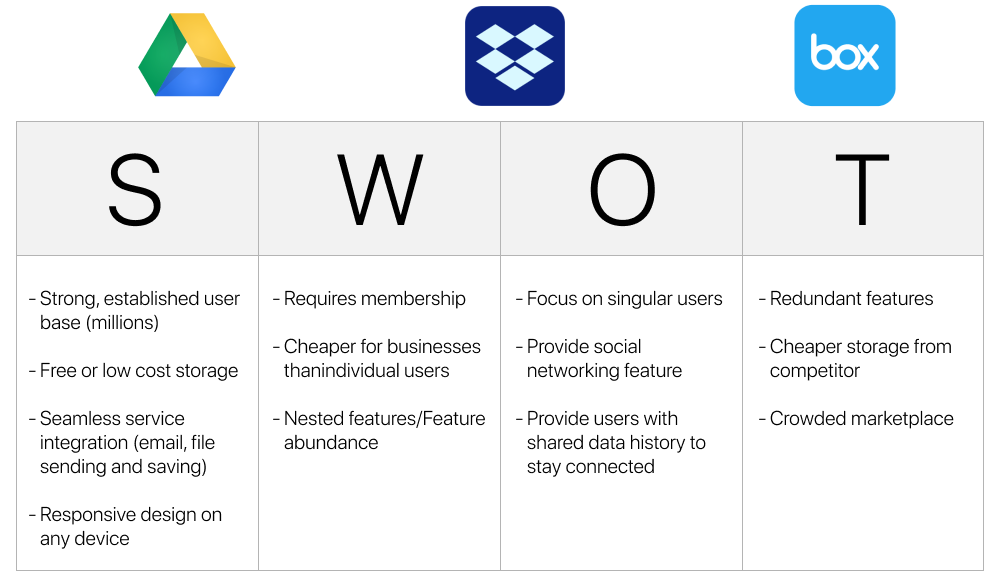
I was confident that I would be able to address these problems. But before moving forward in the design process, I needed more information. I began market research by conducting SWOT analysis of the other big cloud service competitors (i.e. Google, Dropbox, Box).
DISCOVERY
The client didn’t specifically know what they wanted. But they did, however, mention a desire for a cloud service feature with a “Networking Effect”. They wanted users to be able to make friends and then manipulate their data in this way.
This angle started to take shape. I needed more information so I continued the research phase of the design process and created surveys in order to better understand two things:
1. What current functionality cloud users feel strongest about?
2. Was the ‘network’ feature something the greater public also desired.
Initially, I was able to determine that users not only use multiple cloud platforms, but that they think of them favourably. Almost all of those questioned used cloud services, and more than one service.

The next point was be a little more difficult to test for.
I asked users in an earlier question to designate what features were important to them, currently. I wanted to nudge users so I added a feature of the cloud that is not available in order to see if it garnered any significant interest (i.e. being able to upload directly to social media).
Following that I asked users to give their own response in regards to a feature that was not currently offered but one they wanted to see from a given cloud storage service.
Not only did users select the planted feature in the earlier question, but they even went so far as to comment in the free response question that this feature was something they wanted.
Here is an example:
PERSONAS
I focused on user needs by making Personas, trying to put myself into the users shoes.
CASUAL USER
EXPERT USER

INFORMATIONAL HIERARCHY
Prioritizing things like creating an account, uploading files, sharing files, creating files, and adding friends informed the creation of effective User Flows as well as aiding in the creation of the site map.
Site map below:

THE DESIGN PROCESS
I knew I wanted a minimal design. I wanted a UI that acted like a watchtower. From the homepage I wanted users to be able to see, comprehensively, their most recent files and to be able to generally organize quickly. From that point, users would be able to zero-in on a given section and make more nuanced actions. This is the shape of VAPORTRAIL’s information architecture.
As well, I knew that by making overall organization easy the new “collaboration” feature wouldn’t be too esoteric. I wanted to building off current functionality by adding a new feature.
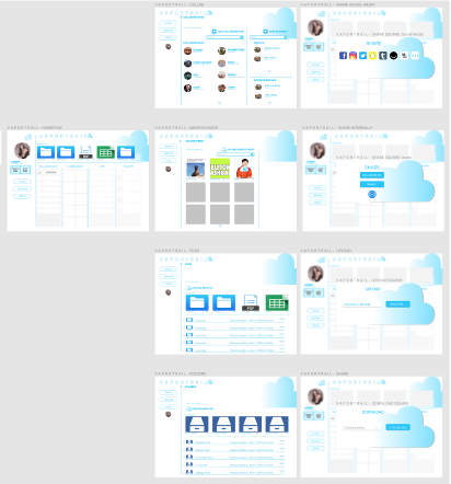
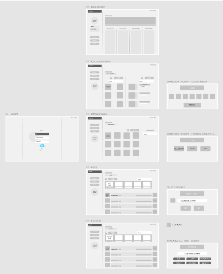
Below is an example of my early wireframing, mockups, early designs.
Playing off the phrase “The Cloud”, I began iterating on the basic design ideas of this new cloud service.
I began drafting logo sketches, iconography, CTAs, typography, and started developing the branding schemes with this project.
After a few rounds of usability testing, I stripped a lot of the original design elements down even more. The main focus was to provide users with familiar functionality and interface so that the new feature I was adding could breathe.

BRANDING
FINAL PRODUCT
From the client briefs, research, analysis, user research, wireframing, content strategy, branding, designing, iterating, usability testing, iteration, and even more testing, I was able to finally arrive at a deliverable product for the client.
This was an incredible learning experience. The process is everything. This is an exercise that made this abundantly clear. Moving into all future projects, big and small, I rely heavily on what I learned through this design process.
I needed to create a starker dynamic between the overall light blue interface.
This design forces the eye of the user while exhibiting boundaries more.
I added a broad divider with pertinent information regarding the users location. By making a broader statement with an attention getting banner, it would cut down on a user questioning whether or not they were in the right place. It also provides direction in that everything under the banner is where you would be doing work. I creates a space and fulfills the design idea to provide users with a comprehensive overview.
This change was the last step in creating VAPORTRAIL.


